Designers need to understand basic psychological rules that influence human behavior. In this post, we will look at three key psychology areas used in design: color psychology, Gestalt principles, and the role of typography.
Color psychology
Colors play a big role in creating first impressions, emotions, and associations for users. Color psychology studies how different colors affect our feelings and behavior. Every color triggers different reactions in the user’s mind and is connected to their emotions. In UX design, remember that emotions often guide users. Using colors in the right way can strongly support your product.
Here are some basic rules for how colors can be used in UX/UI design:
- Blue: Associated with calmness, trust, and professionalism. Often used by banks and tech companies.
- Green: Relaxing, symbolizing nature, health, and peace. Common in health and eco-related apps.
- Red: Creates strong emotions like passion and energy, but also signals danger. Useful for drawing attention, for example in call-to-action (CTA) buttons.
- Black: Modern, elegant, and luxurious, but can also feel heavy.
When choosing colors, it’s important to consider cultural context, because color meanings can differ between countries and regions.
Gestalt principles
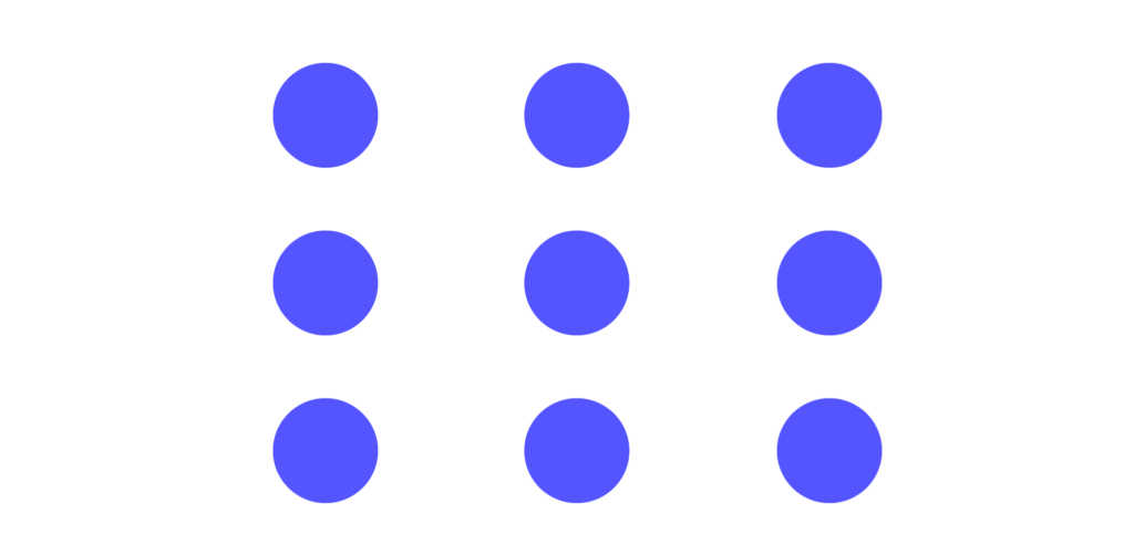
At the beginning of the 20th century, German scientists started studying how people organize, categorize, understand, and perceive visual elements. They noticed that people always try to bring order to chaos. Based on these observations, they created a set of principles that describe our natural tendency to find harmony in disorder. They discovered that the human mind processes visual information as a whole first, and only later notices individual parts. They also found that the mind naturally and automatically simplifies complex visual forms and organizes chaos. This discovery helps UX designers reduce mistakes and create interfaces that feel intuitive to users. Here are some examples:
- Principle of proximity
The human mind tends to see elements that are close to each other – whether objects or text – as being connected or belonging together. Using the same colors, shapes, or textures helps group related elements and creates visual consistency.
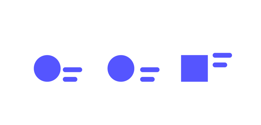
- Principle of similarity
Similar does not mean identical, but our mind tends to group similar objects and see them as one whole. Elements that look alike are perceived as connected. Using the same colors, shapes, or textures helps group related elements together.
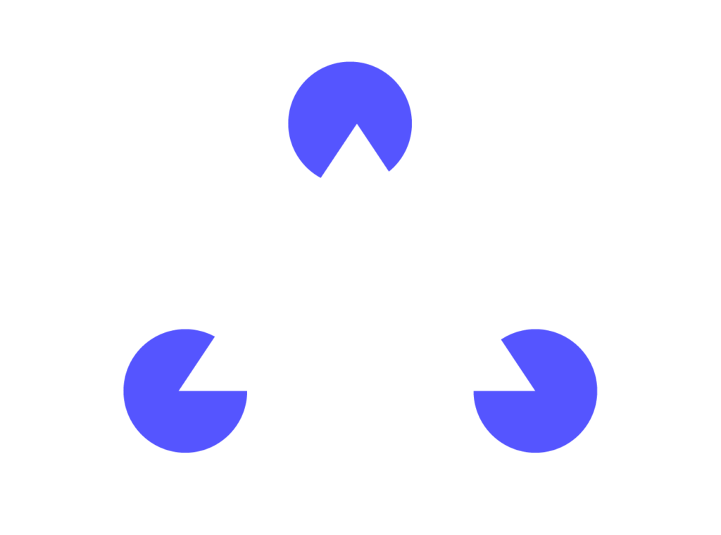
- Principle of closure
People tend to see incomplete shapes as complete. In UX/UI design, this can be used to create cleaner and more elegant designs that do not need to show every detail.
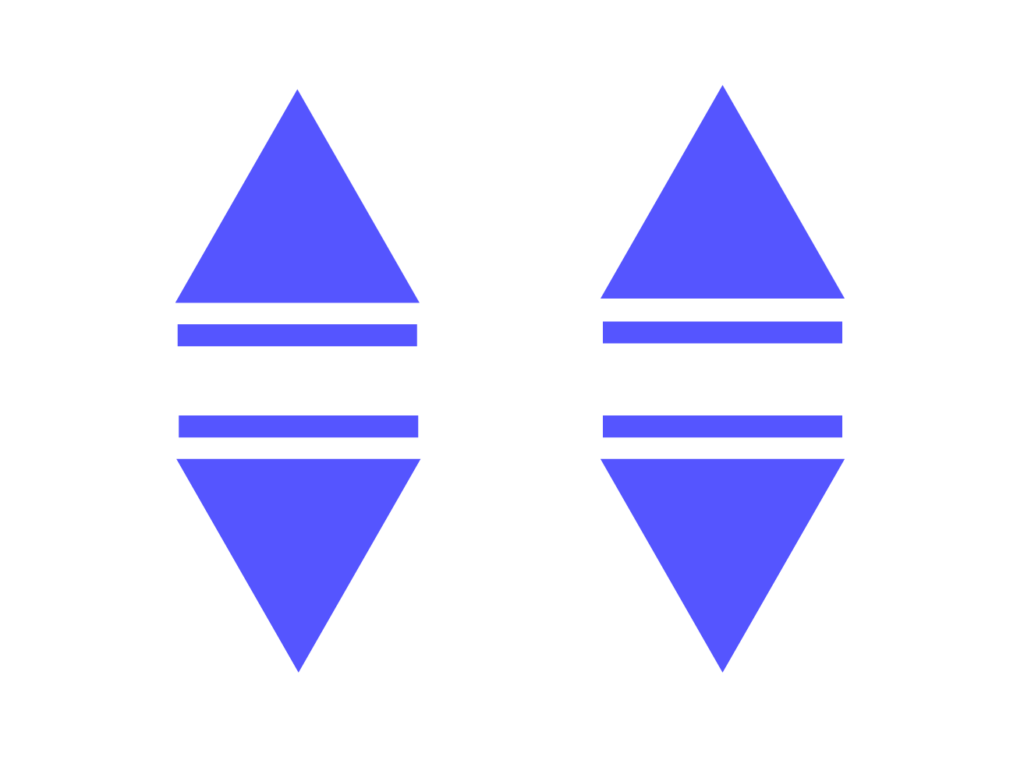
Principle of symmetry
Why do symmetrical layouts stand out and catch our attention? It’s because they suggest order, harmony, and calm within chaos, which helps our mind relax. That’s why we have a natural tendency not only to group symmetrical elements, but also to look for symmetry in the world around us.
The role of typography
It’s not only graphic elements that attract the user’s attention. Good user-focused design also requires understanding how people read. When reading, a person does not analyze each letter one by one – instead, the eyes “jump” across the text, taking in about 7 letters at a time. Focusing on one part of the text takes about 250 milliseconds.
Peripheral vision also plays an important role. It allows us to notice up to 15 characters, but only about 7 of them can be processed for meaning at the same time. Because of the way the mind processes text, longer lines (around 100 characters) can make reading easier and faster, since the eyes need fewer “jumps” between lines. However, lines that are too long should be avoided to keep the message clear, short, and easy to understand.
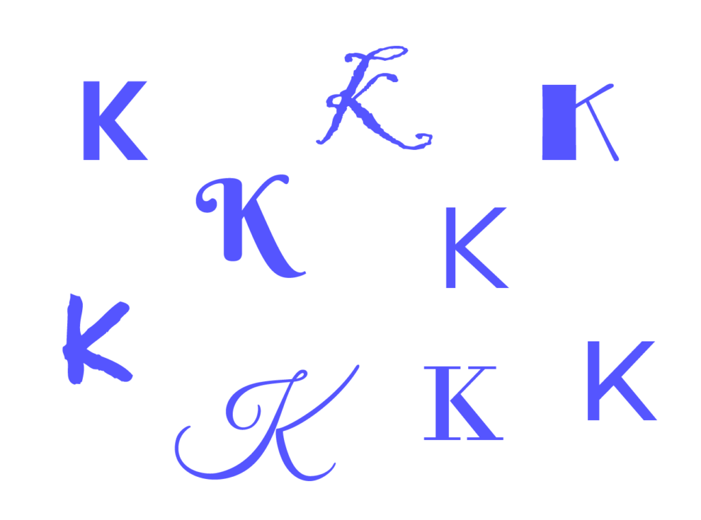
Choosing the right font is also important. Using a very decorative or unusual typeface can slow down reading, because the mind recognizes familiar letter shapes from common fonts much faster.
Summary
Psychology plays an important role in UX/UI design, helping designers create interfaces that are more intuitive, attractive, and engaging. Colors influence users’ emotions, Gestalt principles help organize visual elements, and typography affects readability and information hierarchy. Using these principles in practice allows designers to build interfaces that are not only visually appealing but also functional and user-friendly. This leads to a better user experience, which increases satisfaction and engagement.